 |
| Grocer's Aisle, 2016 |
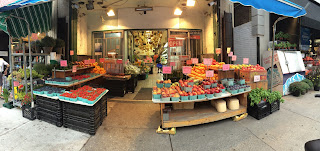
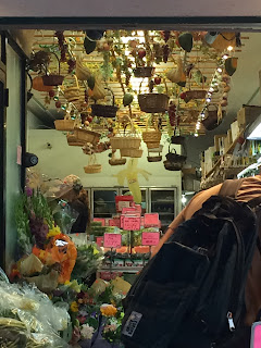
So with this new piece, I wanted to make more pixel-based works. It's based off a photo I taken on a recent day trip to The Beach neighbourhood. There's one grocery store that has a hanging trellis, attached with baskets and leaves. It looked like a really interesting installation so I took a few snapshots.
The banner piece had to be made at the format of 550 H x 1920 to 3840 L for Freelancer, so the work may appear too small for seeing the details of each pixel. Surprisingly, it takes a long while to do pixel work as it does for a painting. Normally, pixel works are small, even the animated gif ones but this was a large scale project so it was taking several hours to work on each section. Here are some enlargements of each section, 2X to 3X the normal size to see the details better.
Some of the products are parodies of what brands I've had or seen. Like Coke bottles, Arizona tall canned iced tea, Baci Chocolates, Honey Bee plastic bear bottles, etc. Looking at grocery store photos from the internet also helped with seeing the different kinds of packaging that our foods and drinks come in. For the racks and doors, Photoshop had allowed me to make translucent layers to show glass panes, bottles and plastic containers. Using its Edit > Adjustments > Hue/Saturation option also allowed me to make quick recolour copies. Not for all of them though; I applied some better colour tints/shades choices with the computer's adjustments.
Like most Photoshop/Illustrator works, I make many layers for each part: The booth with solid colour backing, the shelves, the baskets, the gondola labels, the produce, etc. For an easier time of making identical items for different recolours/redesigns like the jars, I have one layer for the contents (the jam/jelly) and another for the container (the glass jar with lid). The jar layer is translucent (half see-through) and separate so I can easily cut & paste the layer's pixels over and over. For the more solid items like the peppers, onions and tomatoes, I saved a template of each item for later use on a hidden sample layer. Then I can just recolour, cut & paste them in a group of items (with a little touch-up of values). The exceptions here are the pumpkins and melons as I made individual layers in a group layer folder.
For some items like in the Shelves section, I made a double layer of some products to be place behind the original. I did 2 methods of darkening the double layers behind: one was setting the eraser tool to 50% opacity to make the pixels translucent to allow the solid colour backing to make the items appear further back on the shelves and the other, I took the solid colour from the shelves' backing and coloured over them after using the wand tool to marquee them and setting the pencil tool to 30% opacity. The difference between the 2 methods are that the first one is more see through while the latter is solid with the overlaying brown wash. The first method I used mostly for the plastic packaging.
While digital imaging programs do make it easy to copy other items to recolour in the same scale size, it's not so much when you custom-scale your cuts for a larger or smaller one. Clicking off the anti-alias option for the marquee/selection tools helps with keeping the colours pixels inside the selection from bleeding, having a cleaner edge as you custom-scale and paint with the pencil tool. For Photoshop in Edit > Preferences in General section, you can change the Image Interpolation to Nearest Neighbor, which would allow you to custom-scale your selections without the pixels' colours mixing with one another.
Even then, the detail of the original markings don't keep as well as vector graphics in Illustrator. A little of touching up will always be liking as detail is lost or stretched out when you custom-scale. For these enlarged inserts without losing the original details, I've scaled them larger from 100% to 200-300%, by hundredths easily.
If you want to see the advice that helps with changing the Photoshop settings to make pixel artworks, here's the link to a Youtube video by Luiz Zuno, a very talented game graphics artist:
If the video doesn't explain all your questions on this, there's plenty of other Youtube time lapse videos by artists that regularly upload their progress on their works online. Or maybe pay for a Udemy course on making pixel art/game graphics. I would recommend 'Pixel Art for Videos Games' by Marco Vale which I've taken and learnt a few new tricks on Photoshop for it. It's also a lifetime access upon a purchase of $40 approx. (Look out for discount coupon codes in your emails) so it's of good value.
I don't tend to (not yet anyways) record my progress on my work as I seem to complete these things slower than the estimated times I read from other artists' times. To be fair, they are usually smaller sized works, about 700 px or less, probably. This one took me over a week to work on with a few hours each day. I should try to do smaller formats when doing future pixel works.
Well, onto the next work of art...


No comments:
Post a Comment